In the Time Series Data Service on Proficloud.io, you can now use boxplot charts easily and simply. We are currently focusing on the function that allows users to import templates in the Time Series Data Service – so users benefit from the quick implementation and customization options.
What is a boxplot diagram?
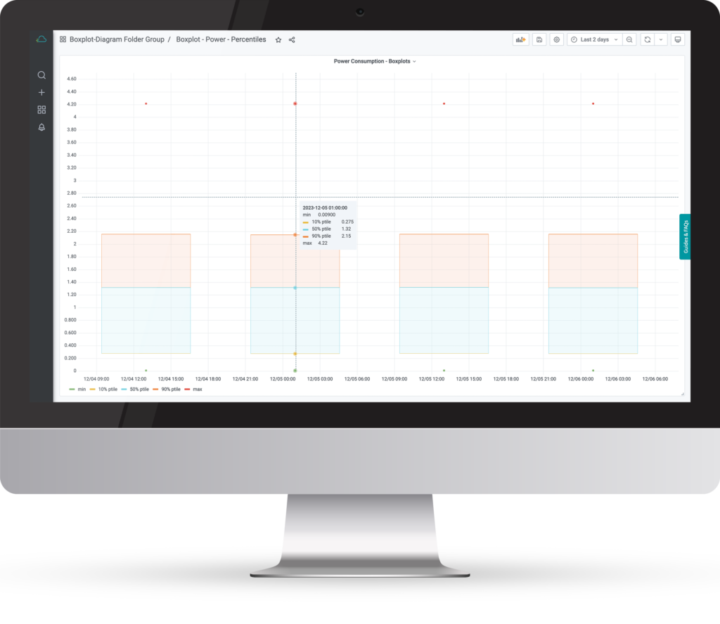
A boxplot diagram, also known as a box-and-whisker plot, is a graphical representation of statistical data that helps to understand the distribution and characteristics of a data set. It consists of a rectangular “box” that represents the interquartile range (between the first and third quartiles) and “whiskers” or “antennae” that show the range of the data. Here are some simple explanations of why boxplot charts are beneficial:
Easy to read summary
Boxplots provide a compact summary of important statistical information, including median, quartiles and potential outliers. This provides a comprehensive understanding of the data in a single graph.
Identification of anomalies
By clearly displaying outliers, boxplots can make unusual or deviating values easily visible. This is particularly useful for identifying potential problems or exceptions in a data set.
Comparison of data groups
Boxplots enable a quick comparison of different groups or categories within a data set. This is important for recognizing differences and patterns between different data categories.
Simple interpretation of distributions
The shape of the box and the length of the whiskers visualize the data distribution and show how strongly the data scatters around the median. This makes it easier to interpret scatter and identify trends.
Efficient communication
Boxplots offer a simple and effective way to communicate complex statistical information. This makes them particularly useful in presentations, reports or discussions where a clear visualization of the data is required.
In summary, boxplot diagrams provide a clear method of presenting key characteristics of a data set. They are particularly useful for identifying outliers, understanding data distributions and making comparisons between different groups.
How can I use the boxplot chart in the Time Series Data Service on Proficloud.io?
To be able to integrate the boxplot diagrams into your own dashboards, you need to carry out the following steps (if you do not already have a Proficloud.io account, register here for free):
- Download the JSON template here: Boxplot diagram or with the link above
- Open the Time Series Data Service
- Hover over the [+] and then click on “Import”
- Upload the JSON file here
- Add the UUID of your device and the metric you want to display in the boxplot diagram
- Click on import
Happy analyzing!
Note: You can now add further visualizations to this dashboard or copy the panel that you see and paste it into another dashboard. You only need to adjust the queries if you insert this diagram into another dashboard.