Time Series Data Service FAQs
Everything you every wanted to know about the Time Series Data Service and how to use it.
Can I assign permissions directly on dashboard level?
No. Permissions cannot be assigned exclusively on dashboard level. They are primarily managed on folder level.
How can I give a user different permissions in different dashboards within the same folder?
To allow a user to have different roles per dashboard in a folder, the user must first be added on folder level with the lowest permission level (Viewer).
Afterwards, the user can be upgraded in a specific dashboard (e.g. to Admin).
Can I add a user directly to a dashboard?
No. Users must always be added through the folder.
On dashboard level, you can only adjust the role (e.g. Viewer → Admin) if the user already has access via the folder.
What options do I have to manage access?
- Role-based: Assign permissions through predefined roles.
- Directly: Add specific users to a folder.
In both cases, access always starts at the folder level.
Example: A user should be Admin in Dashboard #1 but only Viewer in Dashboard #2.

In Dashboard #2, the user remains Viewer.
Add the user on folder level as Viewer.
In Dashboard #1, upgrade the user’s role to Admin.
Tip: Use roles if many users require similar permissions. For individual cases, you can upgrade specific users in a dashboard.
Problem
Continuous energy data should be grouped to reflect consumption per shift – starting at 03:00, then 11:00, 19:00, and so on.
Solution
With the right query, the data can be grouped into 8-hour intervals that start with a 3-hour offset. This ensures the shift times are displayed correctly instead of starting at midnight (00:00) by default.
Steps
For this example, we’re using the Graph widget – but the process works exactly the same for any other widget.
- Select your device and metric (as usual).
- Set the SELECT function to
last()to display the last value of each interval (avoiding averages). - Optional: For continuous values, add
difference()to visualize the energy consumed within each 8-hour interval. - In GROUP BY time, use
time(8h,3h):8h= duration of each bucket3h= start offset, shifting the beginning from 00:00 to 03:00- Result: values at 03:00, 11:00, 19:00, etc.
Requirements: Two metrics are required, one containing the longitude data and one containing the latitude data.
Select and set up visualization
After you have created a new dashboard, you can add an empty panel. You can then select the Worldmap panel in the right-hand column under > Visualization.
As soon as you have done this, new options will appear in the Worldmap tab (directly below).
Scroll down until you see the Map Data Options, here set the Location Data to “table”.
For Field Mapping, select “coordinates” for Table Query Format and fill in the other fields (the source/settings of the data will follow in the next step)
Optional settings are e.g. zoom level, colors, sizes of the points etc. – just try it out!
Set queries (metrics)
In the Queries area, first select the device that supplies your coordinates and the metric. Click on the + in the SELECT line and add an alias. Here you name the alias “longitude” if it is the longitude data.
Now remove the GROUP BY line settings, otherwise the Worldmap Panel will not work properly.
In the FORMAT AS line, set the setting to Table.
Repeat the process for latitude data. You can now add a metric following the same pattern.
Now switch to the tab above the queries called Transform. Search for “Prepare time series” in the search field and activate this transformation by clicking on it.
You should now see the points that were sent in the set time period.
The dashboards in the TSD Dashboard Library already do a lot of the work for you.
In order for the dashboard to interpret these metrics correctly, the variables must be named correctly. Below you will find the correct naming of the variables so that they can be displayed automatically in the dashboard.
Note: Before you can see data in any dashboards, the metrics must be activated in the Device Management Service. Only then can they also be used in the Time Series Data Service.
Names of the metrics for the Battery Energy Storage System (BESS) dashboard of the TSD Dashboard Library
| Function | Metric name | Explanation |
|---|---|---|
| State of Charge | State_Of_Charge | State of Charge is the real-time measurement of the battery’s remaining capacity. |
| Apparent Power | Apparent_Power | Apparent Power is the real-time measurement of the total power, including both active and reactive components, in an industrial battery storage system; by tracking it, you can detect load imbalances, plan resource allocation, and maintain efficient operation. |
| Active Power | Active_Power | Active Power is the real-time measure of the actual power consumption or generation within an electrical system. |
| Current L1 | Current_L1 | Current L1 is the real-time current flow in phase L1; by accessing it remotely via the Time Series Data Service, you can monitor it live to detect load peaks early, optimize the system, and promptly troubleshoot issues. |
| Current L2 | Current_L2 | Current L2 is the real-time current flow in phase L2; by accessing it remotely via the Time Series Data Service, you can monitor it live to detect load peaks early, optimize the system, and promptly troubleshoot issues. |
| Current L3 | Current_L3 | Current L3 is the real-time current flow in phase L3; by accessing it remotely via the Time Series Data Service, you can monitor it live to detect load peaks early, optimize the system, and promptly troubleshoot issues. |
| Max Discharging Power | Max_Discharging_Power | Max_Discharging_Power is the maximum power the industrial battery storage system can discharge at any given time; by monitoring it, you can optimize performance, prevent overload, and ensure a reliable energy supply. |
| C Rate Max Charging | C_Rate_Max_Charging | C_Rate_Max_Charging describes the maximum charging rate for the battery in an industrial storage system; by monitoring this parameter, you can ensure safe and efficient energy management. |
| Energy Content Available for Discharging | Energy_Content_Available_For_Discharging | Energy_Content_Available_For_Discharging indicates the total amount of energy the industrial battery storage system can currently supply; tracking this value helps ensure stable and efficient power delivery. |
| Conductor Voltage L1 To Earth | Conductor_Voltage_L1_To_Earth | Conductor_Voltage_L1_To_Earth indicates the measured voltage between the third phase (L1) and earth in an industrial battery storage system, allowing you to ensure safe and stable operation and detect potential faults early. |
| Conductor Voltage L2 To Earth | Conductor_Voltage_L2_To_Earth | Conductor_Voltage_L2_To_Earth indicates the measured voltage between the third phase (L2) and earth in an industrial battery storage system, allowing you to ensure safe and stable operation and detect potential faults early. |
| Conductor Voltage L3 To Earth | Conductor_Voltage_L3_To_Earth | Conductor_Voltage_L3_To_Earth indicates the measured voltage between the third phase (L3) and earth in an industrial battery storage system, allowing you to ensure safe and stable operation and detect potential faults early. |
| Frequency | Frequency | Frequency represents the number of alternating current cycles per second in an industrial battery system, allowing operators to maintain grid stability and prevent potential equipment damage. |
| Temperature | Temperature | Temperature measures the thermal conditions within an industrial battery system; monitoring it helps ensure safe operation, prevent damage, and maintain optimal performance. |
| Reactive Power | Reactive_Power | Reactive_Power represents the portion of power in an industrial battery storage system that oscillates between source and load without producing net energy transfer; monitoring it helps maintain voltage stability and improve overall system efficiency. |
| Max Charging Power | Max_Charging_Power | Max_Charging_Power indicates the maximum power the industrial battery storage system can draw for charging; knowing this limit ensures safe operation and optimal performance. |
| DC Power | DC_Power | DC_Power indicates the direct current power flow in an industrial battery storage system, enabling accurate assessment of charging and discharging processes and ensuring efficient operation. |
| State of Health | State_Of_Health | State_Of_Health indicates the battery’s overall condition and ability to meet its designed performance in an industrial battery storage system; monitoring it enables proactive maintenance and helps maintain reliable operation. |
| DC Voltage | DC_Voltage | DC_Voltage indicates the measured voltage level in the direct current circuit of an industrial battery storage system, enabling effective power management and ensuring reliable operation. |
| Full charge cycles | Full_Charge_Cycles | Full_Charge_Cycles indicates the total number of complete charge cycles performed by an industrial battery storage system; tracking this helps evaluate battery aging and schedule maintenance. |
| Energy Content Free For Charging | Energy_Content_Free_For_Charging | Energy_Content_Free_For_Charging indicates the remaining capacity available to store energy in an industrial battery storage system; monitoring this helps you plan and optimize charging operations. |
The dashboards in the TSD Dashboard Library already do a lot of the work for you. Some of the work is currently also performed by the PLCnext Engineer library from the PLCnext Store – for example, the data from the devices connected to the controller (e.g. AXC F 2152) is read out here.
This data must then be created as an outport and Proficloud variable in PLCnext Engineer and can then be transferred to Proficloud.io via the PLCnext controller.
Note: The library from the PLCnext Store, which “collects” the data for the QUINT4 dashboard, contains more than just the TRIO3 components, but you can simply use them.
In order for the dashboard to interpret these metrics correctly, the variables must be named correctly. Below you will find the correct naming of the variables so that they can be displayed automatically in the dashboard.
Note: Before you can see data in any dashboards, the metrics must be activated in the Device Management Service. Only then can they also be used in the Time Series Data Service.
Names of the metrics for the QUINT4 dashboard of the TSD Dashboard Library
| Function of device (Variable in PLCnext Engineer) | Metric name | Explanation |
|---|---|---|
| High temperature present | QUINT4_Status_High_Temperature | The QUINT4_Status_High_Temperature status display on the QUINT4 power supplies from Phoenix Contact indicates that the temperature of the unit has reached a critical value. This can indicate overheating, which can be caused by various factors such as high ambient temperatures or an overload of the power supply. |
| Restart of device present | QUINT4_Op_Rt_s_Restart | The designation QUINT4_Op_Rt_s_Restart refers to the operating time and restart function of the QUINT4 power supplies from Phoenix Contact. This function enables the power supply to restart automatically after a failure or overload. It shows how often the QUINT4 power supply has been restarted. |
| Operating time of the device since the last restart | QUINT4_Status_Operational_runtime | The QUINT4_Status_Operational_runtime status display on the QUINT4 power supply units from Phoenix Contact shows the operating time of the unit. This display provides information on how long the power supply unit has been in operation. This information can be useful for planning maintenance intervals and monitoring the reliability of the power supply. |
| Status of the Input Voltage DC | QUINT4_Status_Input_Voltage_DC | The QUINT4_Status_Input_Voltage_DC status indicator on Phoenix Contact QUINT4 power supplies shows the input voltage of the unit when it is operating in direct current (DC) mode. This indicator helps to ensure that the input voltage is within the specified range to ensure proper operation. |
| Total operating time | QUINT4_Total_Op_Rt | The designation QUINT4_Total_Op_Rt on the QUINT4 power supply units from Phoenix Contact stands for the total operating time of the unit. This display indicates how long the power supply unit has been in operation in total. This information is useful for planning maintenance work and for monitoring the reliability of the power supply. |
| Temperature of device | QUINT4_Device_Temp | The QUINT4_Device_Temp status indicator on the QUINT4 power supplies from Phoenix Contact shows the temperature of the unit. This indicator helps to monitor the operating temperature and ensure that the power supply is operating within safe temperature limits. |
| Remaining service life of the device | QUINT4_Rem_Service_Life | The designation QUINT4_Rem_Service_Life on the QUINT4 power supply units from Phoenix Contact stands for the remaining service life of the unit. This display indicates how long the power supply unit is expected to continue to function reliably, based on the current operating conditions and previous use. |
| Boost-mode 100 active | QUINT4_Status_Boost_100 | The QUINT4_Status_Boost_100 status display on the QUINT4 power supplies from Phoenix Contact indicates that the power supply unit is operating in boost mode and has currently reached 100% of its boost capacity. This means that the power supply is providing the maximum additional power to cope with short-term load peaks. |
| Health status of the device (healthy) | QUINT4_State_Of_Health | The designation QUINT4_State_Of_Health (SOH) for the QUINT4 power supplies from Phoenix Contact refers to the state of health of the battery. This display provides information about the current performance and condition of the battery compared to its new condition. |
| Boost-mode 75 active | QUINT4_Status_Boost_75 | The QUINT4_Status_Boost_75 status display on the QUINT4 power supplies from Phoenix Contact indicates that the power supply is operating in boost mode and has currently reached 75% of its boost capacity. This means that the power supply is providing increased power to cope with short-term load peaks. |
| Health status of the DC | QUINT4_Status_DC_OK | QUINT4_Status_DC_OK is a status display for the QUINT4 power supplies from Phoenix Contact. This indicator signals that the output voltage is within the normal range and that the power supply is working properly. If the DC OK LED lights up green, this means that the output voltage is above 90 % of the set value. |
| Frequency | QUINT4_Frequency | The QUINT4 power supplies from Phoenix Contact support a frequency range of 50 Hz to 60 Hz for the alternating current (AC) input with a tolerance of -10 % to +10 %. This enables use in various network environments worldwide. |
| Input voltage L3 L2 | QUINT4_InputV_L3_L2 | The designation QUINT4_InputV_L3_L2 for a QUINT4 power supply from Phoenix Contact refers to the input connections of the power supply unit. Here, L3 and L2 stand for the phase connections in a three-phase network. These connections are part of the input voltage supply, which is necessary for the operation of the power supply. |
| Input DC | QUINT4_InputV_DC | QUINT4_InputV_DC refers to the input voltage of the QUINT4 power supply unit, which is designed for direct current (DC). These power supplies can accept a specific DC voltage as input voltage to generate the required output voltage. The exact input voltage depends on the specific QUINT4 series model. |
| Over Voltage Protection | QUINT4_OVP | QUINT4_OVP stands for Over Voltage Protection in the QUINT4 power supplies from Phoenix Contact. This function protects connected devices from overvoltage by ensuring that the output voltage does not exceed a certain value. With QUINT4 power supplies, the voltage is typically limited to below 28.8 V or 30 V. |
| Dynamic Boost | QUINT4_Dyn_Boost | QUINT4_Dyn_Boost refers to the dynamic boost function of the QUINT4 power supplies from Phoenix Contact. This function enables the power supply to deliver a higher current at short notice in order to cover peak loads. Specifically, the dynamic boost can provide 1.5 times the rated current for up to 5 seconds12. |
| Output | QUINT4_OutputA | The designation QUINT4_OutputA for the QUINT4 power supplies from Phoenix Contact refers to the output current of the unit. This is measured in amperes (A). The exact level of the output current depends on the specific model of the QUINT4 series. For example, a model can deliver an output current of 20 A or 40 A. |
| Number of impulses | QUINT4_Impulses | The designation QUINT4_Impulses in the QUINT4 power supplies from Phoenix Contact refers to the unit’s ability to supply short-term current pulses. These pulses may be necessary to cope with load peaks or short-term overloads. The QUINT4 power supplies are designed to provide these pulses safely and reliably. |
| Starts of devices | QUINT4_Device_Starts | The QUINT4_Device_Starts designation on the QUINT4 power supplies from Phoenix Contact refers to the number of times the unit has been restarted. This information is used to monitor the frequency with which the power supply has been restarted, which can be useful to assess the reliability and stability of the power supply. |
| Number of selective fuse breaking impulses | QUINT4_SFB_Impulses | The designation QUINT4_SFB_Impulses refers to the Selective Fuse Breaking (SFB) technology of the QUINT4 power supplies from Phoenix Contact. This technology enables the power supply to briefly deliver 6 times the rated current for 15 milliseconds12. As a result, standard circuit breakers can be triggered quickly and reliably to selectively shut down faulty current paths and keep important system parts in operation. |
| Temperature of cabinet | QUINT4_Temperature | The QUINT4 power supplies from Phoenix Contact are designed for a wide temperature range. They can be operated in environments with temperatures from -40°C to +70°C. This makes them particularly robust and versatile, even under extreme conditions. |
| Number of transients | QUINT4_Transients | The designation QUINT4_Transients for the QUINT4 power supplies from Phoenix Contact refers to the unit’s ability to handle transient overvoltages. These transient overvoltages, also known as voltage spikes, can be caused by various factors such as switching operations or lightning strikes. The QUINT4 power supplies are equipped with protection mechanisms to absorb these voltage peaks and protect the connected devices. |
| Status of the IO link module | QUINT4_Status_IO_Link | The QUINT4_Status_IO_Link metric refers to the status of the IO-Link interface of the QUINT4 power supply from Phoenix Contact. This interface enables communication and monitoring of the power supply unit in industrial networks. IO-Link provides detailed status data that can contribute to maintenance planning by detecting problems at an early stage. |
| Status of the Relais 1314 | QUINT4_Status_Relais_1314 | The QUINT4_Status_Relay_1314 metric refers to the status of the relay contact 13/14 of the QUINT4 power supply from Phoenix Contact. This relay contact can be configured to indicate different states of the power supply, such as whether the output voltage is within the desired range. |
| Status of boost 50 | QUINT4_Status_Boost_50 | The QUINT4_Status_Boost_50 status display on the QUINT4 power supplies from Phoenix Contact indicates that the power supply is operating in boost mode and has currently reached 50% of its boost capacity. This means that the power supply is providing increased power to cope with short-term load peaks. |
| Input voltage L3 L2 | QUINT4_InputV_L2_L3 | The designation QUINT4_InputV_L2_L3 for a QUINT4 power supply from Phoenix Contact refers to the input connections of the power supply unit. Here, L3 and L2 stand for the phase connections in a three-phase network. These connections are part of the input voltage supply, which is necessary for the operation of the power supply. |
| Input voltage L3 L2 | QUINT4_InputV_L1_L2 | The designation QUINT4_InputV_L1_L2 for a QUINT4 power supply from Phoenix Contact refers to the input connections of the power supply unit. Here, L1 and L2 stand for the phase connections in a three-phase network. These connections are part of the input voltage supply, which is necessary for the operation of the power supply. |
| Output voltage | QUINT4_OutputV | The QUINT4_OutputV metric refers to the output voltage of the QUINT4 power supply from Phoenix Contact. These power supply units offer an adjustable output voltage that typically ranges from 24 V DC to 29.5 V DC. The exact voltage may vary depending on the model and configuration. |
| Status about the remaining life of device | QUINT4_Status_Service_Life | The QUINT4_Status_Service_Life status display on the QUINT4 power supplies from Phoenix Contact provides information on the status of the remaining service life of the unit. This display helps to monitor the reliability of the power supply and to plan maintenance measures in good time. |
| Status output voltage | QUINT4_Status_Output_Voltage | This metric shows whether the output voltage is behaving normally. |
| Status phase failure | QUINT4_Status_Phase_Failure | The QUINT4_Status_Phase_Failure status display on the QUINT4 power supplies from Phoenix Contact signals a phase failure. This means that one or more phases of the input voltage in a three-phase network have failed or are outside the permissible range. A phase failure can affect the performance and reliability of the power supply and requires immediate inspection and rectification of the problem. Translated with www.DeepL.com/Translator (free version) |
| Status output power | QUINT4_Status_Output_Power | The QUINT4_Status_Output_Power status indicator on the QUINT4 power supplies from Phoenix Contact shows the current output power of the unit. This indicator helps to monitor the performance of the power supply and ensure that it is operating within the specified limits. |
The dashboards in the TSD Dashboard Library already do a lot of the work for you. Some of the work is currently also performed by the PLCnext Engineer library from the PLCnext Store – for example, the data from the devices connected to the controller (e.g. AXC F 2152) is read out here.
This data must then be created as an outport and Proficloud variable in PLCnext Engineer and can then be transferred to Proficloud.io via the PLCnext controller.
Note: The library from the PLCnext Store, which “collects” the data for the TRIO3 dashboard, contains more than just the TRIO3 components, but you can simply use them.
In order for the dashboard to interpret these metrics correctly, the variables must be named correctly. Below you will find the correct naming of the variables so that they can be displayed automatically in the dashboard.
Note: Before you can see data in any dashboards, the metrics must be activated in the Device Management Service. Only then can they also be used in the Time Series Data Service.
Names of the metrics for the TRIO3 dashboard of the TSD Dashboard Library
| Function of device (Variable in PLCnext Engineer) | Metric name | Explanation |
|---|---|---|
| Health status of a channel | TRIO3_CH2_Status | Refers to a single channel. This metric sends a 1 if the status occurs and a 0 if this status is not or no longer active. The metric begins with the identification of the device or data source, followed by the identification of the channel from which this status originates (e.g. CH1, CH2, CH2 …). |
| 80% usage of a channel reached | TRIO3_CH1_80P | Refers to a single channel. This metric sends a 1 if the status occurs and a 0 if this status is not or no longer active. The metric begins with the identification of the device or data source, followed by the identification of the channel from which this status originates (e.g. CH1, CH2, CH2 …). |
| Short circuit occurred in a channel | TRIO3_CH1_ShortCircuit | Refers to a single channel. This metric sends a 1 if the status occurs and a 0 if this status is not or no longer active. The metric begins with the identification of the device or data source, followed by the identification of the channel from which this status originates (e.g. CH1, CH2, CH2 …). |
| Overload occured in a channel | TRIO3_CH1_Overload | Refers to a single channel. This metric sends a 1 if the status occurs and a 0 if this status is not or no longer active. The metric begins with the identification of the device or data source, followed by the identification of the channel from which this status originates (e.g. CH1, CH2, CH2 …). |
| Defect occured in a channel | TRIO3_CH1_Defect | Refers to a single channel. This metric sends a 1 if the status occurs and a 0 if this status is not or no longer active. The metric begins with the identification of the device or data source, followed by the identification of the channel from which this status originates (e.g. CH1, CH2, CH2 …). |
| Nominal current (optional), only available, when the nominal current is set on the device | TRIO3_channel_01_nominal_current | Refers to a single channel. This metric sends the actual current of a single channel as a real value. The metric begins with the identification of the device or data source, followed by the identification of the channel from which this status originates (e.g. channel_01, channel_02, channel_03 …). |
| Actual current | TRIO3_channel_01_actual_current | Refers to a single channel. This metric sends the actual current of a single channel as a real value. The metric begins with the identification of the device or data source, followed by the identification of the channel from which this status originates (e.g. channel_01, channel_02, channel_03 …). |
| Overall status of TRIO3 (healthy) | TRIO3_Overall_Status | Refers to the TRIO3 installation. This metric sends a 1 if the status occurs and a 0 if this status is not or no longer active. |
| Status of the DC (healthy) | TRIO3_DC_OK | Refers to the TRIO3 installation. This metric sends a 1 if the status occurs and a 0 if this status is not or no longer active. |
| Total current | TRIO3_total_current | Refers to the TRIO3 installation. This metric sends the total current used with the TRIO3 installation. It is the sum of the current of the individual channels. |
| Power supply voltage | TRIO3_Power_Supply_Voltage | Refers to the TRIO3 installation. This metric sends the total power supply voltage with the TRIO3 installation. It is the sum of the current of the individual channels. |
The dashboards in the TSD Dashboard Library already do a lot of the work for you. Some of the work is currently also performed by the PLCnext Engineer library from the PLCnext Store – for example, the data from the devices connected to the controller (e.g. AXC F 2152) is read out here.
This data must then be created as an outport and Proficloud variable in PLCnext Engineer and can then be transferred to Proficloud.io via the PLCnext controller.
Note: The library from the PLCnext Store, which “collects” the data for the CAPAROC dashboard, contains more than just the CAPAROC components, but you can simply use them.
In order for the dashboard to interpret these metrics correctly, the variables must be named correctly. Below you will find the correct naming of the variables so that they can be displayed automatically in the dashboard.
Note: Before you can see data in any dashboards, the metrics must be activated in the Device Management Service. Only then can they also be used in the Time Series Data Service.
Names of the metrics for the CAPAROC dashboard of the TSD Dashboard Library
| Function of device (Variable in PLCnext Engineer) | Metric name | Explanation |
|---|---|---|
| Health status of a channel | CAPAROC_CH1_Status | Refers to a single channel. This metric sends a 1 if the status occurs and a 0 if this status is not or no longer active. The metric begins with the identification of the device or data source, followed by the identification of the channel from which this status originates (e.g. CH1, CH2, CH2 …). |
| 80% usage of a channel reached | CAPAROC_CH1_80P | Refers to a single channel. This metric sends a 1 if the status occurs and a 0 if this status is not or no longer active. The metric begins with the identification of the device or data source, followed by the identification of the channel from which this status originates (e.g. CH1, CH2, CH2 …). |
| Short circuit occurred in a channel | CAPAROC_CH1_ShortCircuit | Refers to a single channel. This metric sends a 1 if the status occurs and a 0 if this status is not or no longer active. The metric begins with the identification of the device or data source, followed by the identification of the channel from which this status originates (e.g. CH1, CH2, CH2 …). |
| Overload occured in a channel | CAPAROC_CH1_Overload | Refers to a single channel. This metric sends a 1 if the status occurs and a 0 if this status is not or no longer active. The metric begins with the identification of the device or data source, followed by the identification of the channel from which this status originates (e.g. CH1, CH2, CH2 …). |
| Defect occured in a channel | CAPAROC_CH1_Defect | Refers to a single channel. This metric sends a 1 if the status occurs and a 0 if this status is not or no longer active. The metric begins with the identification of the device or data source, followed by the identification of the channel from which this status originates (e.g. CH1, CH2, CH2 …). |
| Nominal current (optional), only available, when the nominal current is set on the device | CAPAROC_CH1_NominalCurrent | Refers to a single channel. This metric sends the actual current of a single channel as a real value. The metric begins with the identification of the device or data source, followed by the identification of the channel from which this status originates (e.g. CH1, CH2, CH2 …). |
| Actual current | CAPAROC_CH1_ActualCurrent | Refers to a single channel. This metric sends the actual current of a single channel as a real value. The metric begins with the identification of the device or data source, followed by the identification of the channel from which this status originates (e.g. CH1, CH2, CH2 …). |
| Total system current result | CAPAROC_Total_System_Current_Result | Refers to the CAPAROC installation. This metric sends the total current used with the CAPAROC installation. It is the sum of the current of the individual channels. |
| Total current shutdown | CAPAROC_Total_Current_Shutdown | Refers to the CAPAROC installation. This metric sends a 1 if the status occurs and a 0 if this status is not or no longer active. |
| System input voltage result | CAPAROC_System_Input_Voltage_Result | Refers to the CAPAROC installation. This metric sends the total input voltage used with the CAPAROC installation. It is the sum of the current of the individual channels. |
| Channel with 80% capacity reached present | CAPAROC_80PWarning_Sum | Refers to the CAPAROC installation. This metric sends a 1 if the status occurs and a 0 if this status is not or no longer active. This metric shows whether there is a channel in the CAPAROC installation that is at 80% capacity. |
| Channel with error state present | CAPAROC_Channel_Error_Sum | Refers to the CAPAROC installation. This metric sends a 1 if the status occurs and a 0 if this status is not or no longer active. This metric shows whether there is a channel in the CAPAROC installation that is in an error state. |
You cannot modify the dashboards directly; changes you make to the dashboards are not saved permanently.
However, if you want to change the dashboards and adapt them to your own use cases, this is perfectly possible in a different way. The only thing you need to do is to save the dashboard that you want to change in a new folder in your dashboards.
To do this, simply click on the cogwheel symbol in the top right-hand corner of the relevant dashboard and then click on “Save as” in the left-hand bar. Now select one of your own folders and you can modify the dashboard as you wish.
The Time Series Data Service offers several options for processing incoming values. It is important to note that the calculations must be adjusted in each widget.
Show simple calculation with a static value
Show multiple metric calculation
Show cumulative sum calculation
How can I calculate my incoming values with a static value (multiply, divide, sum, subtract)?
With the “Math” function in the Time Series Data Service, static values can be easily inserted into queries for calculation.
- Open the widget in which you want to use a static value for the calculation
- In the query view, navigate to the “SELECT” line and click on the “+” at the end of the line
- Select the “math” option here under “math”
- A function is now added to the “SELECT” line. You can use simple calculations here.
How can I use two or more incoming metrics to create a new metric (e.g. multiply, divide, sum, subtract)?
With the “Transform” function in the Time Series Data Service, different metrics can be calculated together to create a new metric for a widget. Please note, that the transform option is not available for all visualization options.
- Open the widget in which you want to calculate a new metric
- Switch to the “Transform” tab
- Select the “Add field from calculation” transformation
- Decide if you want to calculate based on a predefined option (Total, mean, max, min …) or simply select “Binary option”
- Select the queries you want to use and the calculation option
- Rename the new metric and optionally hide the “source metrics”
How can I add up the values of a day?
With the “cumulative_sum” function within a query, all values in a period can be added up to calculate a total value for this period.
- Open the widget in which you want to calculate the cumulative sum of a specific timerange
- In the query view, navigate to the “SELECT” line and click on the “+” at the end of the line
- Select the “cumulative_sum” option here under “Transformation”
- Change the timerange to the specific time range you need
You can add just about any image to your dashboard, including a logo. This allows you to make your dashboards look even more like your company.
Either watch the video below or follow the steps below.
- Open the dashboard where you want to add a logo (or image).
- Click on the symbol at the top right (graph with +) to add an empty panel.
- Click on “Add new Panel” in the new panel
- Change the general settings so that the background is transparent and delete the title from the “Panel Title” field
- Select the “Text” visualization on the right-hand side.
- Change the style to HTML instead of Markdown
- Now insert this snippet (pure HTML) into the text field:
<img style="height:REPLACEHEIGHT;" src="REPLACESOURCE">
and replace the source (online source of your logo) and the height of the logo - Now click on Apply in the top right corner and then save your dashboard
- You can now set the size of the panel and move it to the position where you want to place it.
In principle, metrics are compressed after one year.
If you need the data in full resolution for a longer period than one year, please contact us! We will work out a solution with you so that you can use the data in full resolution even after one year.
Get in touch with us!
Are you interested in Smart Services Powered by Proficloud.io? Please do not hesitate to contact us. Also, if you have any suggestions or comments, just send us a message to inbox[at]phoenixcontact-sb.io and we will answer as soon as possible.
In short: No, there is no limit to the number of metrics that can be sent to Proficloud.io and the Time Series Data Service.
The subscriptions that can be booked for the Time Series Data Service range from 50 metrics in the smallest package to 1500 metrics in the largest package. If you want to send more metrics to Proficloud.io and the Time Series Data Service for your company, please get in touch with us!
We will put together a customized package for you, with which you can use the required number of metrics on Proficloud.io in the Time Series Data Service.
The refresh rate in the Time Series Data Service can be set to 15 minutes as the shortest refresh rate in the free contingent; in the paid contingent, you can set the refresh rate to 5 seconds.
You can update the dashboard manually in both the free and paid versions of the Time Series Data Service, e.g. to view newly sent data immediately.
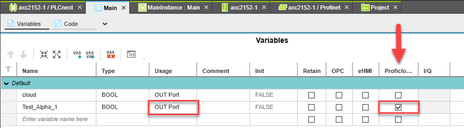
If the device is online on Proficloud.io in the Device Management Service and you have ticked the variables in PLCnext Engineer for Proficloud, but you still do not see any data, this may be due to another setting in PLCnext Engineer.
The variables must be declared as “OUT Port” for use on Proficloud.io.
You can also find more on this topic here:
Basically, the User Management Service regulates the access rights to Proficloud.io. In the Time Series Data Service, these basic rules can be supplemented with additional rights assignments at dashboard or dashboard group level.
Out of the box, every user has access to all dashboards based on their role in the User Management Service. In other words, a user who is in an organization as a viewer will only see the data in the dashboards to which they have access through the User Management Service. As a viewer, they can view the data, but cannot make any changes. However, they can change settings such as the time period shown.
In the Time Series Data Service, it is possible to give a user access to entire dashboard groups or to individual dashboards in the “General” folder.
If user A has view rights to dashboard group 1, he can view all the dashboards in it, but cannot change them. User A can also be granted edit rights to another dashboard group and can therefore also change the dashboards (but always within the scope of the User Management Service; they do not have access to any other devices in the Time Series Data Service that they do not also have access to in the Device Management Service).
How to grant access to a group
- Navigate to all available dashboards
Either via this link: https://tsd.proficloud.io/dashboards or via the four squares on the left-hand side by clicking on “Manage” - Click on the group whose access rights you want to change
- You can now click on the “Permissions” tab
- If you want to grant certain people access to this group, first remove the “Editor” and “Viewer” roles. As an admin, you still have access to this group, but no one else will be able to see this group for the time being.
- Click on “Add Permission”
- Where the default value is “Team”, select “User”
- In the adjacent field, you can see all available users by clicking on the field.
- You can now select the rights to the right of “Can”. These are explained in the drop-down menu.
The rights that you distribute at group level are inherited by the dashboards that are in this group.
How to grant access to dashboards
Special access rights can be assigned to dashboards that are in the “General” group. Dashboards in other groups are defined by the group access rights.
- Navigate to all available dashboards
Either via this link: https://tsd.proficloud.io/dashboards or via the four squares on the left-hand side by clicking on “Manage” - Open the desired dashboard whose access rights you want to set.
- Click on the cogwheel in the top right-hand corner
- Navigate to the “Permissions” entry
- If you want to grant certain people access to this dashboard, first remove the “Editor” and “Viewer” roles. As an admin, you will still have access to this dashboard, but no one else will be able to see these dashboards for the time being.
- Click on “Add Permission”
- Where the default value is “Team”, select “User”
- In the adjacent field you can see all available users by clicking on the field.
- You can now select the rights to the right of “Can”. These are explained in the drop-down menu.
- Now save the dashboard to make the new access rights effective.
It is not possible to select two or more time periods with the main data picker in the top right corner. If you want to show different timeframes you can use the “Relative time” functionality in the query builder.
Different settings for the relative time
now-1h (Last hour)
This query selects data recorded in the last 60 minutes before the current time (Now).
now-6h (Last 6 hours)
This query selects data recorded in the last 6 hours before the current time (Now).
now-1d (Last day)
This query selects data recorded in the last 24 hours before the current time (Now).
now-7d or now-1w (Last week)
This query selects data recorded in the last 7 days before the current time (Now).
now/M (Current month)
This query selects data recorded in the last 30 days before the current time (Now). Note that this is an approximation for the current month, as months have varying numbers of days.
now/Y (Current year)
This query selects data recorded in the last 365 days before the current time (Now).
Now-1y (Last year)
This query selects data recorded in the year before the current time (Now).
d (Days), h (Hours), m (Minutes), and s (Seconds) as units:
You can also specify precise time ranges in days (d), hours (h), minutes (m), and seconds (s). For example, “Now-2d” would select data from the last 2 days before the current time.
Using relative time ranges allows you to dynamically respond to changes over time without manually adjusting queries. These relative time notations are particularly useful when visualizing real-time data or quickly switching between different time ranges.
Video on how to take a look at all months of 2023 in one dashboard
avg()
This calculates the average (mean) value of the data points within a given time window. For example, if you have temperature readings every minute, you could use avg() to find the average temperature over the last hour.
min()
This gives you the smallest value in the data series during the specified time window. If you’re monitoring server response times, min() would give you the lowest response time within a certain period.
max()
On the other hand, this function gives you the largest value in the data series within the time window. For instance, you could use max() to find the highest CPU usage over the past day.
sum()
This function adds up all the values in the data series within the specified time range. If you’re tracking the total data transferred by a network device, sum() would give you the cumulative data transfer in a specific time period.
count()
This simply counts the number of data points within the chosen time frame. It’s useful if you want to know how many events occurred within a certain time period, like the number of logins in the last 15 minutes.
last()
This gives you the value of the most recent data point in the selected time range. If you’re monitoring a sensor that reports its status, last() would provide the latest status update.
median()
The median is the middle value in a sorted dataset. It’s useful when you want to find the central tendency of your data while being less affected by extreme values, unlike the mean. For instance, you might use median() to find the median response time of a web server.
diff()
This calculates the difference between consecutive data points in the time series. It’s helpful for tracking how much values change from one point to the next. If you’re measuring the number of new user sign-ups, diff() could tell you how many new sign-ups happened in each time interval.
diff_abs()
Similar to diff(), this calculates the absolute difference between consecutive data points. It’s like taking the positive value of the difference, so negative changes become positive. Useful for tracking changes regardless of direction.
percent_diff()
This calculates the percentage difference between consecutive data points. It’s a relative measure of change and can help you understand the magnitude of changes in your data.
percent_diff_abd()
Like percent_diff(), this calculates the absolute percentage difference between consecutive data points. It’s useful for understanding relative changes without considering the direction.
count_non_null()
This counts the number of non-null (non-missing) data points within the chosen time range. It’s useful if you want to know how complete your data is during a specific period.
A
A = name of your query. You can also give it a more speaking name in the Query area of the panel.
5m,now
The Time Series requires you to have a period of time to evaluate if alerts need to be sent. This time period is the period over which you want to do calculations on, which is why many conditions have aggregate functions like AVG, MAX, DIFF, LAST, etc.
So, when we say Query(A, 5m, now), it means that we evaluate the alert rule on Query A from 5m ago to now. You can also set alert rules that say Query(A, 6m, now-1min) to account for a lag in data being inserted in your data source or network latency.
This is important, because if an alert condition uses Query(A, 5m, now) and there is no data available for now, NO DATA alerts will fire (i.e., there isn’t any data with which to evaluate the rule).
You’ll want to select a time interval to evaluate your aggregate function that’s greater (longer) than the time period in which you add new data to the graph that’s triggering your alerts.
Example: We scrape the database every 10 seconds. If we set an alert rule like Query(A, 5s, now), we’d end up getting NO DATA alert states constantly, because our data is not that fine grained.
If an alert rule has a configured For and the query violates the configured threshold it will first go from OK to Pending. Going from OK to Pending the Time Series Data Service will not send any notifications. Once the alert rule has been firing for more than For duration, it will change to Alerting and send alert notifications.
If you are sending 1/0 (boolean) values to Proficloud.io, you might face the situation, that in the Time Series Data Service you will get a 0.625 value instead of a 0 or a 1. You want to display either 0 of 1, that’s why the “mean” value of a metric is not the right setting.
You need to change the value of your metric to “last”. You can do this as shown in the video below.
- Open the dashboard with the graph panel that displays your boolean data
- In the row “SELECT” remove the “mean()” value
- Click on the “+” on the “SELECT” row and navigate to “Selectors” and click on last
- Open dashboard
- Click on [+] to add a new panel
- Blick on [Add an empty panel]
- Select the Imagelt visualization
- Copy the URL of the image you want to include in your dashboard
- Insert the URL into the input field “Image URL” in the display options
- Optional: Remove the background of the panel by selecting “Transparent” in the general settings of that panel
- Optional: Remove the panel title to have a standalone image
- Change the datasource to — Grafana — to remove the red error triangle at the top left area of the panel
- Open the dashboard you want to set as your home dashboard
- Mark it as favorite in the top bar of the dashboard
- Go to your settings (profile icon at the bottom left corner) and click on “preferences”
- Scroll down to the Home Dashboard area
- Select your new starred dashboard
Prerequisites: The devices to be displayed in the map must have a location in the Device Management Service.
- Create a dashboard
- Adding the “Proficloud.io DMS Plugin” plugin
- Copy the UUID of the device that is to receive an individual link
- Scroll down in the right column and click on “+ Add link”.
- Inser UUID
- Name link
- Enter link destination (other URL, or URL of another dashboard)
- Save dashboard
Unfortunately, it is currently not possible to store a variable or a query as a Y-MAX value in the graph visualization. However, it is possible to achieve the same effect by using an invisible query that has the maximum value. This way the Y-axis is always set to the maximum of the query. The video below shows how this works.
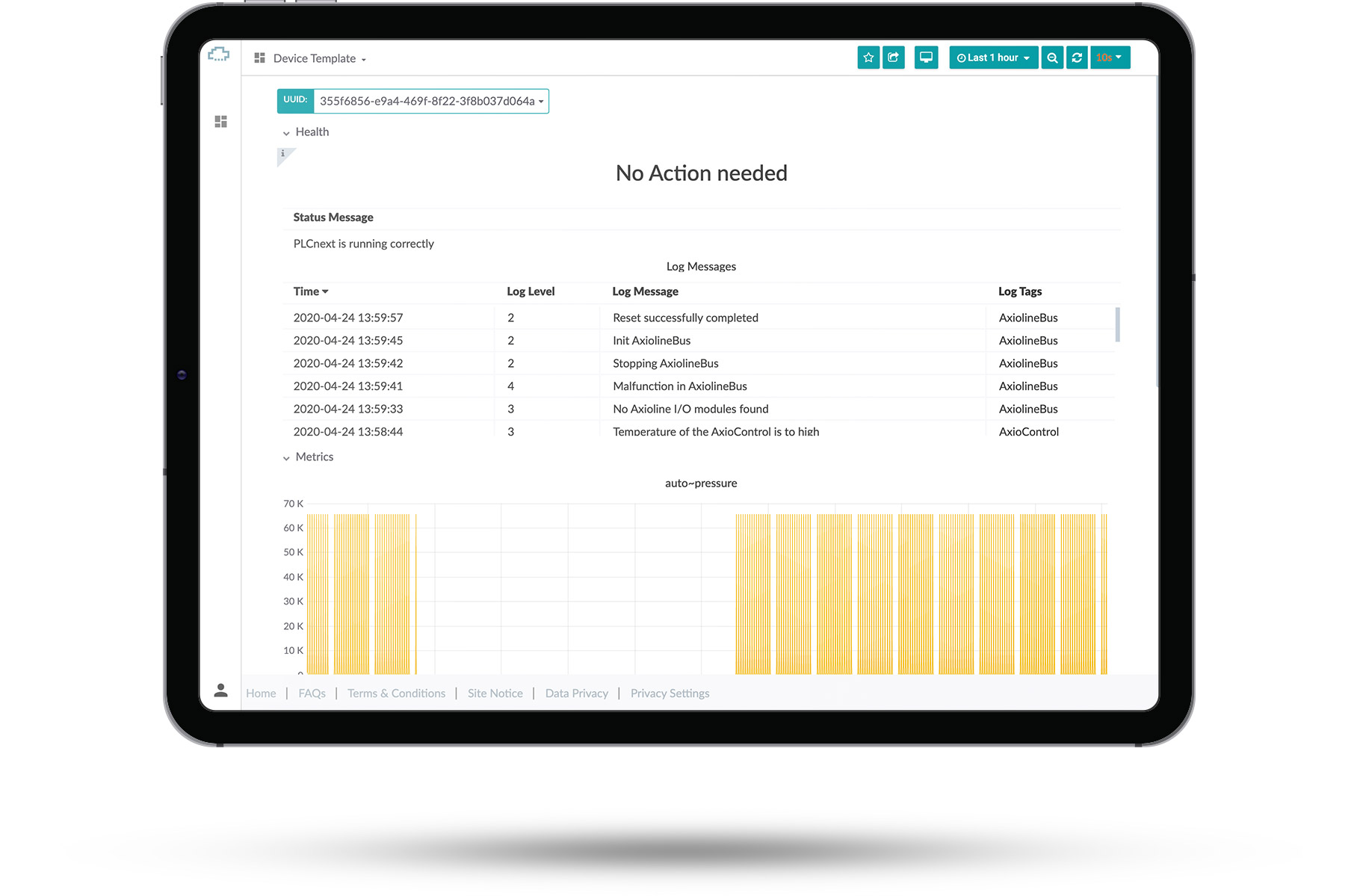
You can see an overview of the different default templates we currently offer.
Select one of them to see what they look like. After you’ve selected a dashboard you can change the UUID of the device you’re looking at in the top left corner.
There you can see basic information about your devices and check if they are running. These premade templates can’t be edited or removed.
This article contains:
Select data
Select visualization
General options
To get started with creating your own dashboards, please click the small user icon in the bottom left corner, click the “Switch” button and then press the small “switch to” button right behind your email address.
From that point on, you’ve switched to your personal organization, which allows you to create your own private dashboards, which only you can access.
Once you switched to your own organization you can create new dashboards by selecting the [+] button in the left sidebar. This will create an empty dashboard.
A dashboard consists of panels, which can be arranged in a number of ways. A new panel can be added to the dashboard by clicking the [Add Panel] at the top of the screen.
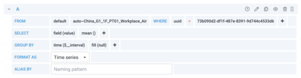
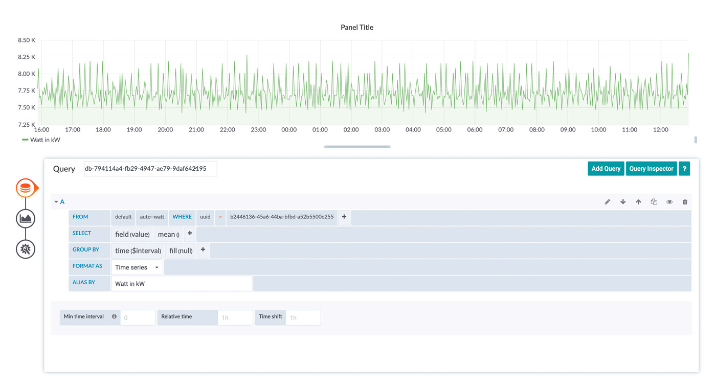
Select data
To retrieve data from your devices you must create a query. The query is sent to our cloud databases and provides you with the resulting data.
There is a graphical helper you can use to built your query in a point-and-click fashion.
- Click on [+] symbol on the left side of your screen, then on [Dashboard]
- Click on [Add Query] to start creating your new dashboard
- Select your data source from the dropdown right next to “Query”
- Build your query using the graphical editor
- Start by selecting a UUID in the “FROM”-row with clicking on the [+] right next to “where”
- Now select one of your UUIDs with a click on [select tag value]
- In the “FROM”-row, click now on [select measurement] so select what data should be displayed in your dashboard
- In the “SELECT”-row you now can change the field of the data inside the graph with clicking on the [+] next to “mean”
- In the “GROUP BY”-row you can set the interval of the data inside the graph
- You can give your data a new alias, with typing in a name in the row “ALIAS BY”
- If your data is written in a smaller frequency than in the “GROUP BY”-row, you can set it here
If there is anything wrong with your query, check the red exclamation mark at the top left of your panel
This is the easiest way of visualization, what you select depends on what you want to see. The best way to learn how the methods work is to try them out.
Select visualization
Click on the graph at the left side of the panel you worked with so far
This tool enables you to personalize the graphic. Click on the box [Graph] next to Visualization
Now you could choose which visualization you want to have for your measurement. There are a few visualization options that can be chosen from. It should be noted that not every visualization is suitable for every type of data.
What you see depends on what you select. The best way to learn how the methods work is to try them out.
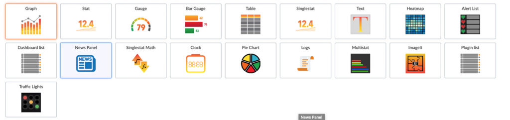
You can also add new visualization option using plugins or remove old ones you don’t need.
After Choosing a Visualization you can edit it to the extend you need to. Every Visualization has different settings ranging from changing the name to visualizing your data in different ways.
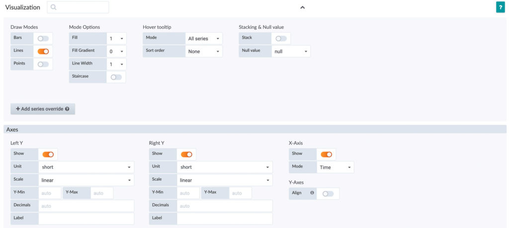
As an example, here you see the options for the Graph Visualization.
Now you can edit the visualization to the format you need. You could change the “Draw Mode” from Line to Bar, fill gaps with data, change the unit or scales of axes.
Just by trying the different type of options, you should get a greater understanding on how to make dashboards and personalize them.
General Options
In the box next to “Title” you can select the name of your Panel.
The option “Transparent” gives you the choice between a transparent and a nontransparent panel.
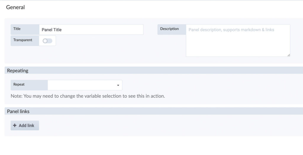
If you want, you can add a description, it supports markdown and links.
Exporting data from the Time Series Data Service as a CSV file is very simple.
Open any dashboard in which you can find a panel with the corresponding data. If you have not yet created your own dashboards, you can also use the Device Template.
Navigate to the panel with the data (metric) you want to export. Here, click on the name of the panel to open the context menu. Here, click on “Inspect” and then on “Data”.
Here you can export the data as a CSV file. The data displayed will always be exported, so if you want a different time period than the one initially set, you must change the time period before exporting.
Please note: If you export data in this way, you can export up to 5000 data points from one device. If you require a larger amount of data, please contact us – we will then provide you with a CSV file containing the required data.
We need the following information for this:
- Timeframe
- UUID of the device
- Metric name(s)
Before we provide you with the data, we check the authorisations so that only authorised persons receive this data.
You can send us an e-mail (inbox[at]phoenixcontact-sb.io) or use the contact form below.
The template dashboards can not be modified. Every modification you make here, will be revoked after a reload of the page.
You can export the templates and import them as your own custom dashboard, where you can also apply changes.
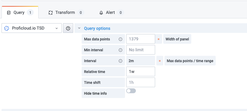
Our cloud system delivers data to your browser where the data is rendered and displayed. We limit the maximum number of data points for each query to 20000 points. Please note, that querying more data points for a single query is not providing much information, because your screen resolution likely does not have the resolution to display all of the data anyway. The limitation keeps processing time in the browser in check and results in a more snappy response of the user side.
If you want to view a larger time range, where you would end up with more than 20000 data points, we recommend you have a look at the grouping and aggregation parameters for the queries. Our template dashboards do this by default. You can choose a grouping interval to suit your needs, but it usually suffices to use the “$__interval” range. This will take the selected time range, your screen resolution and size of the panel into account and our database will aggregate the data for you. You can choose different aggregation options through the query editor. The benefit of this is, that the load is shifted to our cloud system and the amount of data which must be transferred to your browser is reduced. This also results in much smaller workload for your browser resulting in a better user experience. Have a look at the following screenshot for an example:

Time Series Data Alerting allows you to receive notifications of certain threshold violations in the Time Series Data Service. You can also receive these messages when you are not actively working in the Time Series Data Service, for example, by email or messenger.
You can create alerts so you get notifications when a certain rule is fulfilled, for example you could get an email when your device’s temperature is above 64 degrees.
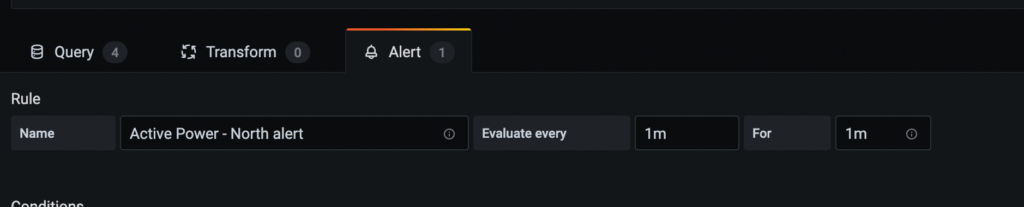
- Navigate to the panel you want to add or edit an alert rule for, click the title, and then click [Edit].
- On the Alert tab, click [Create Alert]. If an alert already exists for this panel, then you can just edit the fields on the Alert tab.
- Fill out the fields.
- Name: Enter a descriptive name. The name will be displayed in the Alert Rules list.
- Evaluate every: Specify how often the scheduler should evaluate the alert rule.
- For: Specify for how long the query needs to violate the configured thresholds before the alert notification triggers
- Now choose your conditions, specify a query
- When: Controls how the values for each series are reduced to a value that can be compared against the threshold. Click on the function to change it to another function.
- Of: Specify a time range. The letter defines what query to execute from the Query tab. “(A,5m,now)” means 5 minutes ago to now. You can also do ”(A,10m,now-2m)” to define a time range that will be 10 minutes ago to 2 minutes ago.
- Is Above: Defines the type pf threshold and the threshold value. You can click to change the type of threshold.
- You can now set the ways of how you want to be notified in the “Notifications” area.
- With a Click on the [ + ] right next to “Send to” you can chose a notification way
- Fill in the message you want to get in case a threshold is violated.
- Tags: Specify a list of tags to be included in the notification
- Navigate to the panel within your dashboard using the appropriate alert.
- Click the name of the panel, and click [Edit].
- Click on the “bell” on the left side of the setting options to get to your configured alerts.
- Click [Delete] in the upper right corner of the setting area.
- Confirm the deletion with a click on [Delete] – The Panel will still be available you are only deleting the alarm.
- Open the Time Series Data Service and navigate to the “Notification channels” with a click on the “bell” in the left side navigation
- Click on [New channel] to set up a new notification channel.
- Here you have to fill in some settings:
- Name: Enter a descriptive name, the name will be displayed when you create a new Alert rule and choose a notification
- Type: Choose how the notification should be sent, for example Email, Slack, Microsoft Teams …
- Default: Use this notification for all alerts
- Include Image: Captures an image and include it in the notification
- Disable Resolve Message: Disable the resolve message [OK] that is sent when alerting state returns to false
- Send reminders: Send additional notifications for triggered alerts
As a reminder you can hover over the “i” symbol to receive more information
(optional): to test if the notification gets send to you click “Send Test” on the bottom.
The times of the data sent by the device must be sent in the UTC format. For this purpose the hardware clock must be set to UTC so that the values get the correct time stamp.
Because the data points that are uploaded have a certain resolution. In the end it’s a group of single data points. You can change the way it’s displayed in the visualization possibilities of the graph. Set Null value on the very right to “connected”.
If the “Evaluate every” and the “For” time have the same value, the alert may not be triggered until after the second cycle. This can be changed if the “For” value is set to a different value (e.g. 30s).
If you want to show average values in the Time Series Data Service, for example, you must specify from which group of data points this should be done. By default, the function is set to “Group by Time Period”, so you can start directly.